
We regularly meet companies that are disappointed in their download numbers. They put money and hours into the show: clips for LinkedIn, posts on Instagram and Facebook, Shorts on YouTube, ads and promotion around every episode. The count at the end of the month does not look like much for all that work.
We tell them the same thing every time: downloads are only part of the story. The clips and posts cut from an episode are the podcast too, and the people who saw them are reach the show earned. Count that next to the downloads and the picture often changes. The show that looked like a small audio channel turns out to be a channel that works.
It rarely gets counted that way, and the monthly slide shows why. The month ends, you pull the downloads from Springcast, copy the numbers from LinkedIn, take a screenshot of the Instagram and Facebook page, and add the views on your YouTube Shorts. Four numbers from four dashboards, on one slide that has to say what the show did for the company. Every number on it was real. They just came from different windows, counted different things, and none of them said whether the clip on LinkedIn brought a single person to the episode. What you saw was not what was there.
We had that conversation often enough that we built it into Springcast. Since September 15, Analytics 3.5 shows the reach of your posts in the same view as your listening numbers, on the same dates, down to the clip that brought the listeners. The Analytics 3.5 deep dive walks through the five questions the release answers. This piece takes the social section on its own: what it changes in the monthly report, how to read it, and why you connect all three channels.
Social analytics is part of pro analytics on Scale. The plan overview is at the end. The screenshots show a demo show with sample data; your own screens will look different.
What the old report showed, and what it left out
Each platform reports on itself, and it does that fine. One counts impressions on a post, one counts reach on an account, one counts views on a Short, and your podcast host counts downloads of a file. Four definitions of "someone saw this", and a marketer who has to put them on one line.
The periods do not match either. Every dashboard opens on its own default window. Your report runs from the first of the month to the last, and the episode went out somewhere in the middle. So the slide compares a post's first week with an episode's first month and calls both September.
None of that is the platforms' fault. They report on themselves. Nobody was reporting on the show.
So the show came out wrong in both directions. Add the impressions to the downloads and the podcast looks bigger than it is, because an impression is someone scrolling past. Leave them off and it looks like a small audio channel, while the clips cut from it carry much of what you post. Neither slide is the show.
And the number that matters most was not on the slide at all. You cut three clips from the episode, posted them, and watched the downloads. There was a bump on Tuesday. The LinkedIn clip went out on Tuesday. That is a hunch, and a hunch does not survive a budget meeting.
Reach next to listening numbers, on the same dates
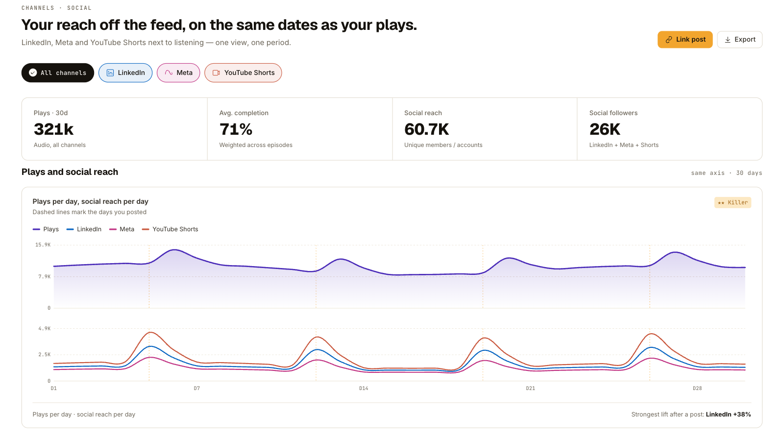
Open Analytics on a show on Scale and the social section sits with the listening numbers, on one time axis. Set the period once and everything follows it: unique listeners, video, and the reach of your posts on LinkedIn, on Instagram and Facebook, and in YouTube Shorts. The month on the slide is the same month for the audio and for the posts, because you picked it once.
Two details from the rest of Analytics 3.5 carry into this section. The listening numbers are bot-free, so what you put on the slide is what a person listened to. Audio and video sit in one view, so a show that goes out in both formats has one set of figures next to its posts.
Two of the new metrics live here, and the Analytics 3.5 deep dive explains both in full. Multi-platform Reach adds audio, video and social into one range, with a correction for people who see you in more than one place. Cross-Channel Referral Lift shows, per post, how much extra listening followed it, beyond what the episode would have done anyway. This piece is about what you do with them on the last day of the month.
How to read it. Read the two lines against each other before you read either one alone. A peak in social reach with a rise in listening under it means the post reached people who then pressed play. A rise in listening with no post behind it came from somewhere else, which is worth knowing before you credit the clips for it.
The clip that pulled the listeners
This is the moment the old slide could not show. A peak in social reach on a date, and the same date in the audio numbers, in one view. That is the Tuesday clip, and next to it the listening that followed.
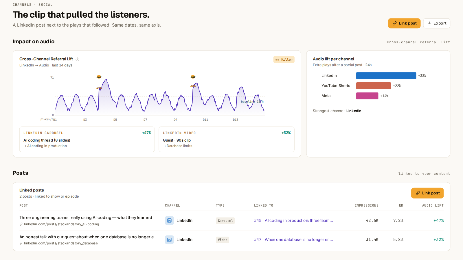
How lift is calculated is in the Analytics 3.5 deep dive. For the report, the reading is short: per episode you now have the post that brought listeners, the channel it ran on, and how much listening followed it, on the same dates as your download curve. A post can also reach a lot of people and move nothing. Then it reached the wrong people, and that is worth knowing before you cut ten more like it.
What you do with it. For a marketer, this turns a clip from content into a test. Three clips per episode, three channels, one view that says which of them brought listening. After a month you know which format works where for your show, and the next episode's clips are planned on that instead of on a feeling.
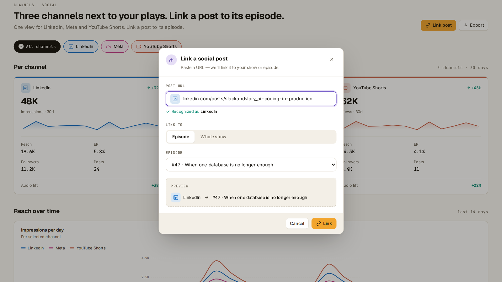
It also changes the shape of the slide. The old one was built per platform, because that is how the numbers arrived. Build the new one per episode: the episode, the clips that went out for it, and the listening each one brought. That is the order leadership asks about it in, and now it is the order the data comes in. Posts are matched to episodes automatically where possible; the ones that are not, you link yourself in the post table.
Connect your channels once
The social section is empty until you connect a channel. You do that once per channel. The three you can connect are LinkedIn, Instagram and Facebook, and YouTube Shorts.
Once a channel is connected, the section fills with the reach of your posts. Connect all three, even the one that is quiet. A channel that brings no listening is a finding too: it tells you where the next hour of editing does not go.
Give it a full month before you draw a conclusion. One episode with one clip per channel is a data point. A month of episodes is a pattern, and a pattern is what you take into the meeting.
What goes on the slide now
Three lines, from one view, on the same dates. The listening numbers are still on it, and they no longer stand alone.
Unique listeners for the month, from the listening numbers. Reach across audio, video and social, as a range, and you report the low end. And the post with the most lift this month, with its channel and what it added to the listening.
The third line is the one leadership asks about, because it answers the question the old slide could not: did the clips do anything? Now the answer is a number with a date and a channel next to it, and next month you can show whether it moved. No leadership to report to? Then the third line is the conversation you have with yourself about whether the clips are worth the evening they cost.
If your report lives in a BI tool, Springcast has an analytics API with Power BI and Looker integration.
Social analytics is new, and we will keep improving it over the coming weeks and months. If a number surprises you, or a channel will not connect, tell us in the app.
Which plan shows what
- Essential has basic analytics.
- Professional has advanced analytics, without the social section.
- Scale has pro analytics with social analytics (LinkedIn, Instagram and Facebook, YouTube Shorts) and custom data.
- Company has everything in Scale.
If you are on Scale
Log in and connect your first channel. The section fills from there.
If you are on Professional
If your show runs on LinkedIn, on Instagram and Facebook, or in YouTube Shorts, Scale is the step.