
Sooner or later, every podcast team gets the same question in a meeting: does anyone listen, and what has the show done for the organization? Many teams answer with a download count, because that is what they have. It tells you a file was requested. It does not tell you whether a person stayed, came back, or heard about the episode in a clip on LinkedIn.
So the podcast gets judged on the one number that shows the least of what it does. Analytics 3.5, live in Springcast since September 15, is built to close that gap.
This deep dive takes five questions you could not answer before. For each one: the problem as organizations have it today, what the new metric makes visible, how to read it, and what to do next. What you see depends on your plan.
These metrics are new, and we will keep improving them over the coming weeks and months. If a number surprises you or a screen does not answer your question, tell us in the app.
All screenshots show sample data from a demo show. Your own screens will look different.
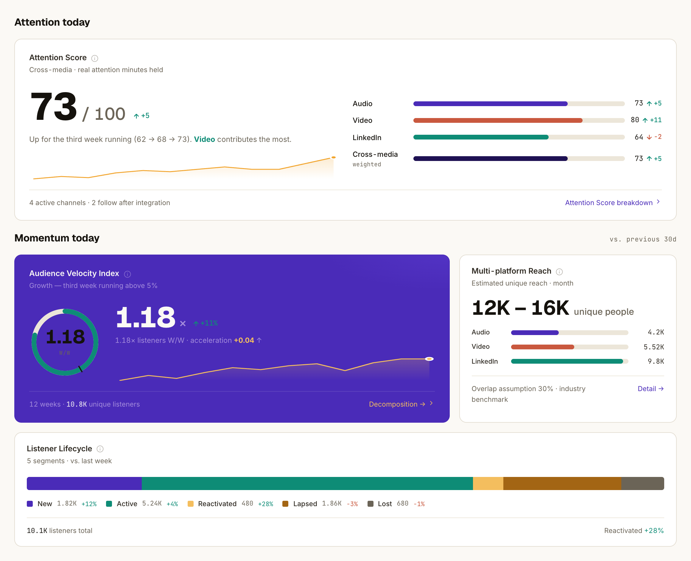
The social parts of this screen are available from Scale.
Downloads count requests. Leadership asks about attention.
Downloads are filtered for bots, but a download still says nothing about listening. A colleague can play the first four minutes and move on, and it counts as a download all the same. So when leadership asks whether people actually listen, the honest answer from a download report is: we don't know.
Attention Score answers that question directly. It is one number from 0 to 100: across every channel, how much real attention does your content earn, out of the attention it could have earned? Each channel gets its own ratio, from how much of an episode people play to engagement per impression, blended into one score. Channels you have not connected do not count against you.
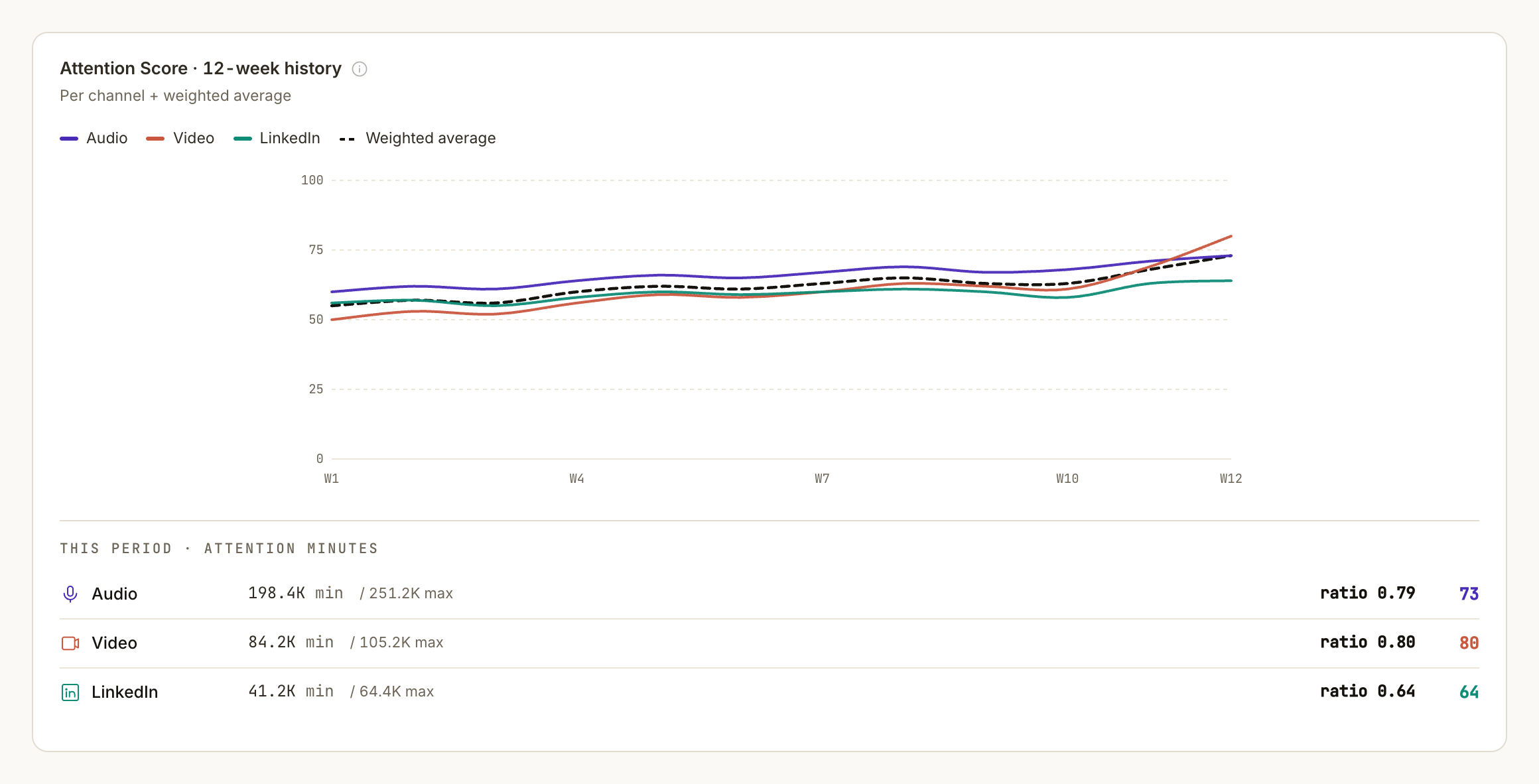
How to read it. Compare the score with your own trend, which is why a 12-week line sits under it. A move of 5 points or more week over week is a real signal. Smaller wobbles are weather. The bars per channel show which one carries the score and which one drags it.
What you do with it. Put the score next to your reach in the report, so leadership sees both how many people you touched and how much of the content they took in. If the score dips while reach grows, you attract people the content does not hold: bring your titles closer to what the episode delivers. The first 30 days of a show or channel are a learning period while the baseline builds.
A stable total can hide an audience that is leaving
Your listener total has been flat for three months. That can mean the same colleagues listen every week. It can also mean half of them stopped and were replaced by new people.
The download report looks identical in both cases, and they call for opposite decisions. One says the format works. The other says you are losing the people you already won.
Listener Lifecycle splits your audience into five groups: New (first heard you in the last 30 days), Active (still listening), Reactivated (back after 30 or more quiet days), Lapsed (quiet for 30 to 90 days) and Lost (quiet for 90 days or more).
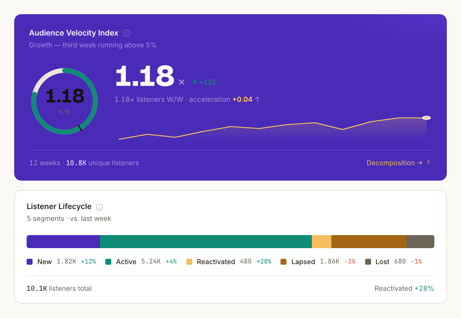
How to read it. Healthy is a thick Active core, a steady inflow of New and a thin Lapsed group. A growing Lapsed group is your early warning: those people have not left yet, they are deciding. Next to it, the Audience Velocity Index compares this week's unique listeners with last week's. 1.00 is flat, below 0.95 is shrinking, above 1.05 is growing, above 1.20 is a breakout.
What you do with it. If Velocity stays below 1.0 for two or three weeks, check your publishing rhythm first, because skipped or irregular releases show up here before anywhere else. If the Lapsed group grows, reach those colleagues with a recap or announce what the next series brings. Report the Active share monthly: it is the cleanest answer to "are people staying?"
A "listener" is a unique listener, the closest honest approximation of a person. Shows younger than 90 days only show New and Active.
Raw downloads punish your newest episodes
When the next season gets planned, someone opens the download list. The episodes from last year are at the top, because they had a year to collect plays. Last month's episode looks weak, whatever its quality. So the choice of topics, guests and length gets made on gut feeling, with a list that mostly measures age.
Episode Health scores each episode against your own show's average, as an index where 1.0 is your normal. It blends downloads, completion and repeat listening.
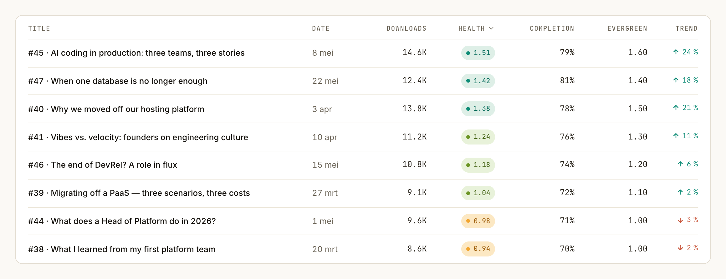
How to read it. 1.0 is normal for your show, 1.4 clearly outperforms and 0.7 underperforms. Health ranks episodes. It is not a trend for the show, because your average episode always scores around 1.0. Fresh episodes carry a "provisional" label until repeat listening has had time to happen.
What you do with it. Bring the top three to the season planning and look at what they share: topic, guest, title, length, publish moment. Then open the weakest one and ask two questions. Did people come? The day-curve on the episode page shows it, and a weak start points at the packaging: the title, the description, the announcement.
Did they stay? Listened % shows it: how much of an episode people play, measured on plays through the Springcast player on your site and in embeds, and shown with its sample. A weak finish points at the content.
Judged on launch week, the catalog stays invisible
Many podcast reports look at the first week after release. But an internal podcast often does its real work later: the onboarding episode a new colleague plays in their first month, the explainer a team comes back to before a reorganization. None of that shows up in a launch-week number, so the part of the podcast that keeps paying off is the part nobody reports.
Evergreen Score is a Day-30 to Day-7 ratio with one of three labels: early spike (front-loaded, then done), steady, or evergreen (listening keeps building well beyond week one).
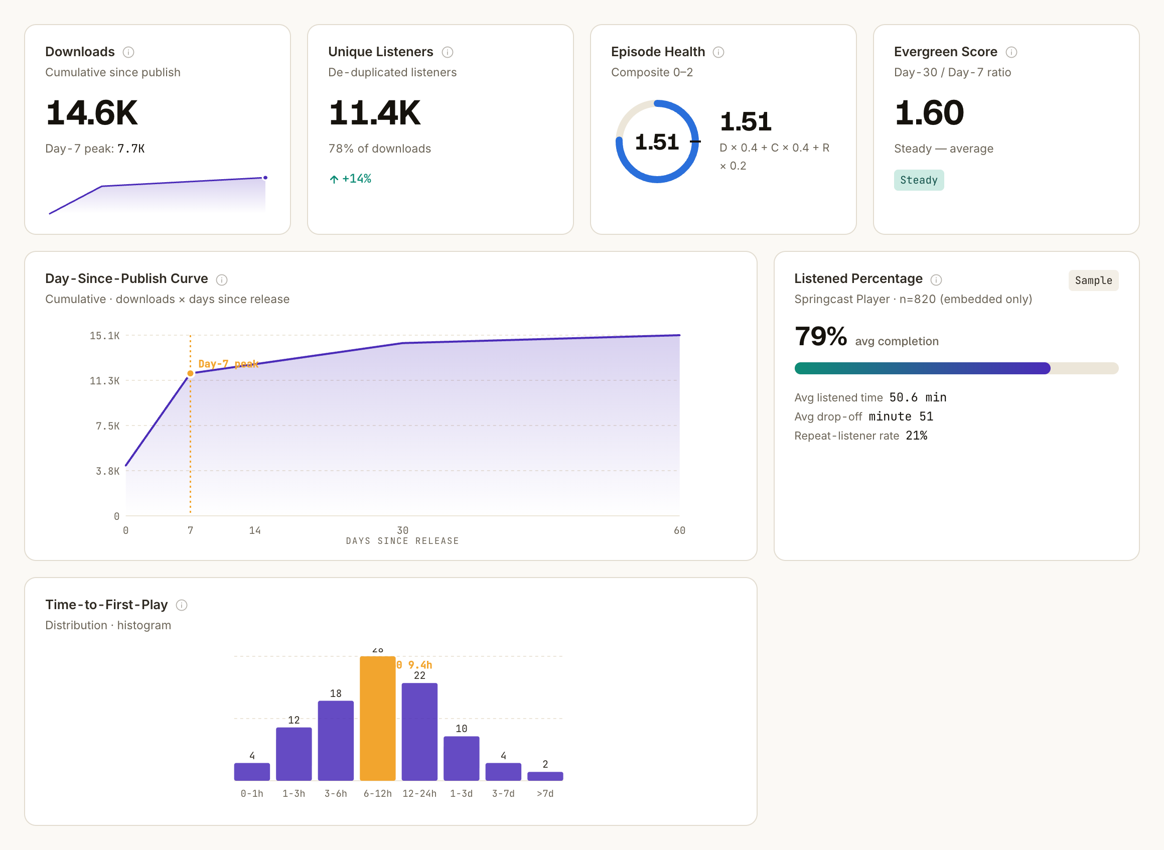
How to read it. The episode page shows the day-curve behind the label, aligned by day so episodes compare fairly. The spike is your announcement power; the tail is how durable the content is. Time-to-first-play shows the median hours from publish to first play. Fresh episodes show "in progress" until a month of history exists.
What you do with it. Count your evergreens once a quarter and put that count in the report. A growing share means the catalog does more of the work, and that is value leadership can see. Link evergreens from new episodes, put them in your onboarding flow, and refresh their titles. An early spike is fine for news: promote it hard in week one.
The podcast is pillar content. The report counts only the audio. (from Scale)
This section applies from Scale: social analytics is part of pro analytics on Scale, and Company has everything in Scale. It covers LinkedIn, Instagram and Facebook, and YouTube Shorts. Professional includes advanced analytics without it.
What we see with our customers: the podcast is reported internally on downloads, while it is often the pillar content of the communication plan. Snippets and social posts are cut from each episode and published.
The reach of those posts is rarely reported alongside the listening numbers, and together they often tell a very different story. The podcast looks like a small audio channel when it feeds much of what you publish.
Multi-platform Reach puts that story in one number, shown as a range: audio unique listeners, video views and social reach combined, with a fixed correction for people who see you in more than one place. It is a range on purpose, because platforms measure differently and audiences overlap.
Video platforms also report views, not viewers, so the video part flatters slightly, and the card says so. Use the low end whenever you will be held to the number.
Reach tells you the podcast traveled. Cross-Channel Referral Lift tells you whether the posts made people listen. For every social post about an episode, it shows how much extra listening the post drove beyond what the episode would have done anyway, as a percentage.
It compares the hours after the post with that episode's own normal rhythm, so an ordinary evening bump is not credited to the post. Rolled up per channel it becomes audio-lift per channel: your channels ranked by the listening they drive.
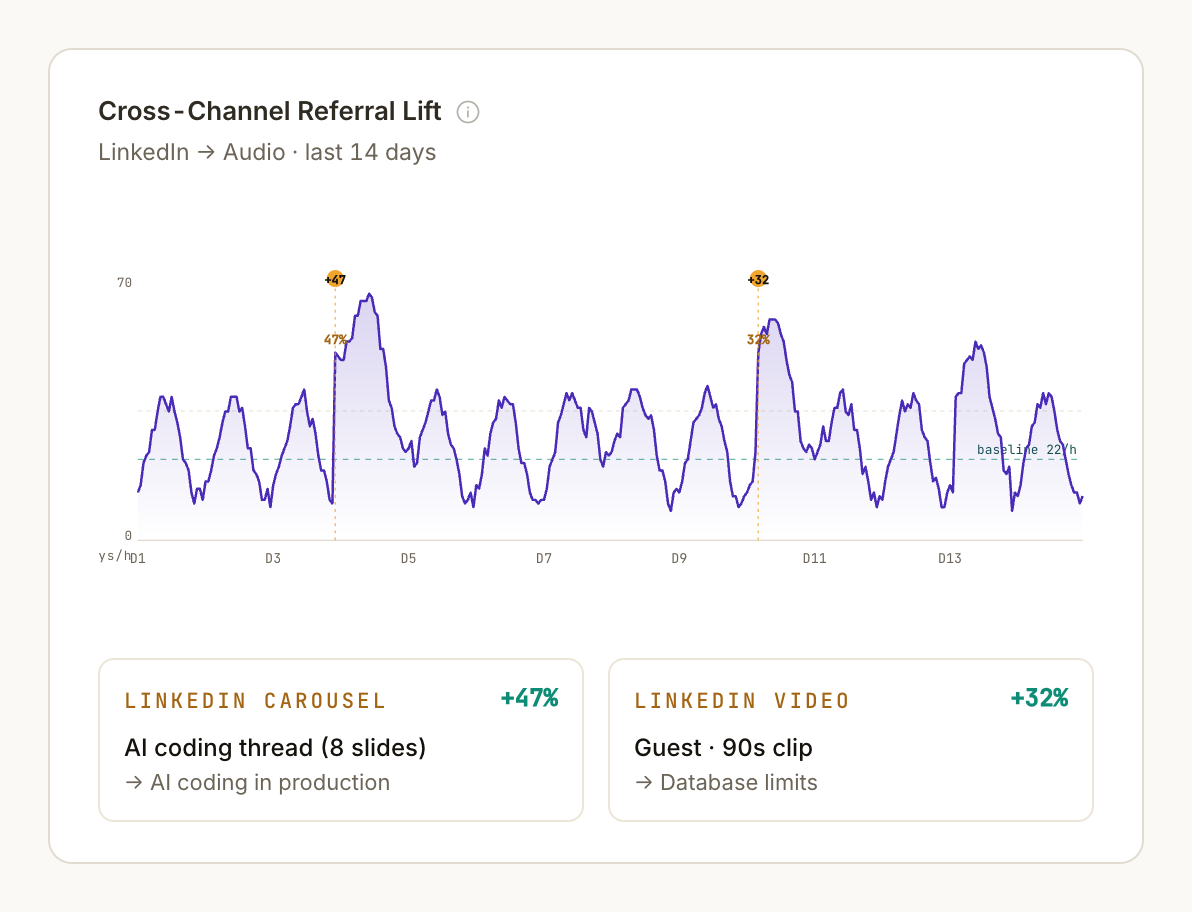
How to read it. +40% means a post drove four extra plays for every ten the episode would have had. Around zero means the post reached people, just not people who listen. Consistency across posts counts for more than one viral outlier.
What you do with it. Report reach and lift together: how far the podcast traveled, and which channel turned that into listening. Move your clips toward the channel with consistent lift, even if another one has bigger impressions. Lift needs posts linked to episodes; auto-detection links most, the rest you link in the post table. Posts about very fresh episodes are marked provisional.
What these numbers do not do
Everything you see is aggregated, and location detail only appears above minimum group sizes. You can report on reach and attention without reporting on a single colleague.
From a download count to the real picture
Proving the return is the question we hear most from internal communication teams. Pick three to five of these metrics for your report, no more.
For an internal podcast: unique listeners over 30 days, Attention Score and the Active share from Listener Lifecycle. From Scale, add audio-lift per channel as a KPI, with Multi-platform Reach beside it for direction.
Set targets from your own 90-day median. Keep ranges and anything marked provisional out of your targets; they show direction. Review once a month, in the same order, and the trend becomes the argument.
Which plan shows what
- Essential has basic analytics.
- Professional has advanced analytics.
- Scale has pro analytics with social analytics (LinkedIn, Instagram and Facebook, YouTube Shorts) and custom data.
- Company has everything in Scale.
If you already use Springcast
Log in, open Analytics on one show and start with the dashboard.
If you are new here
Start a trial and put your own show in it. Fourteen days, no credit card, and your data stays in the EU from the first upload.
If you have to prove it to leadership
Book a demo and bring the question your leadership keeps asking. We will walk through it with you on these screens.